


Local Coupon
E-commerce start-up developed to allow consumers quick access to local deals, cutting intermediaries.
General
Problem statement: How can we automate a consumer’s ability to access deals/coupons in their area?
Target audience: Age 20-50, professionals, no gender-specific
Designed for: Desktop only
Client: Daniel Ramos - Local Coupon Owner
Duration: 6 months
Role: UX and UI Design
Overview
Introducing Local Coupon, a web application that allows users to find offers from local merchants, based on their current GPS location. Local Coupon also empowers merchants to submit their own discount offers into an extensive database, including volume-based packages like 100 coupons per package. The platform manages coupon activation and discounts, so customers can access, track, and reserve deals in no time.
Discovery
What would the success look for the client?
In the early stages of the project, our main challenge was helping the client clarify their vision. With a new concept to work with, we focused on the essential requirements of the app to devise efficient solutions within a tight production timeline. To simplify things, we outlined the core benefits of the product, which helped us narrow down the key expectations.:
- Location ease, the app should help to determine what is near the user at the moment.
- Quick showcase of the price and value to the user.
- Ease of use should be a top priority.
- Visual simplicity would be ideal; the overall feel should be professional and classic.
Competitive analysis
To start off, we reviewed similar services to identify existing limitations and expectations. Our competitive analysis covered both open-source and paid services with a focus on consumer savings. We narrowed down our research to four key competitors and gathered the following information:
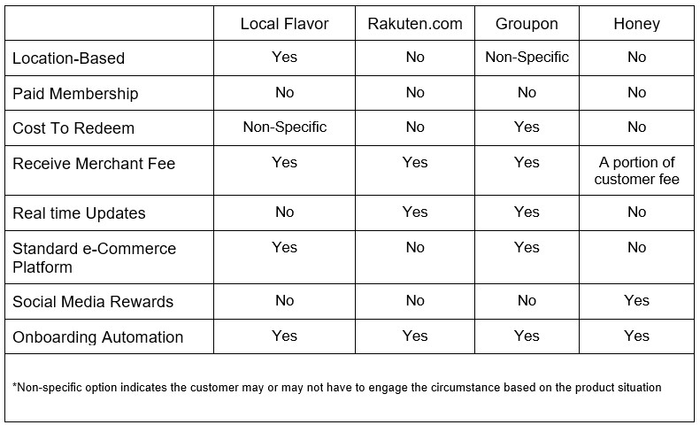
Findings:
- Most competitors offer free deals to first-time users, with no upfront cost.
- Accessibility and automation are crucial for driving return business.
- Half of the competitors provide real-time updates, giving them an advantage in attracting repeat customers.
- User expectations vary based on the platform's approach. Those that follow standard e-commerce practices give users a straightforward buying experience, while those with unique process flows require more attention. Overall, the click-purchase process is preferred over the click-redirect process used by competitors like Rakuten.
- Platforms that follow an e-commerce pattern push an aggressive marketing technique focusing on merchants competing against another.
How will Local Coupon be different?
After analysing competitors, we identified key strengths for Local Coupon: localized search results based on the user's state, direct deals from merchants, and immediate deal redemption.
However, the client insisted on a membership option, which posed marketing challenges. We framed it as a small fee for access to a set number of deals that would ultimately save users money. This issue will require further testing and iteration.
What should the overall design principles establish?
Trust, reassurance, and accountability.
Ease, speed, and responsiveness.
Proper and easy management for both user and provider.
Minimal search time for results.
What needs to be done?
After reviewing the client's requirements and analysing the competition, we proposed the following implementation suggestions:
Introductory information. Provide users with a clear understanding of Local Coupons, how it works, and preliminary customer testimonials to establish trust.
Feature prioritization. Prioritize requirements such as company information, deal availability, QR code activation, and quantity to enhance the user experience.
Establishing a reward system. Offer discounts on memberships for sharing experiences on social media or inviting friends to use Local Coupons. This increases the platform's visibility through savings.
User dashboard. Create a user dashboard for managing reservations, active and past deals, favourite providers, and other automation features.
One-time Fee. Offer a one-time fee for unlimited access to deals, unlike competitors such as Groupon, who require users to purchase multiple deals. This promotes cost value among users and supports the platform's sustainability.
Users reports. Provide merchants with transparent reporting on deal outcomes and performance to help them improve their marketing strategy and reach.
Define
What would the user need?
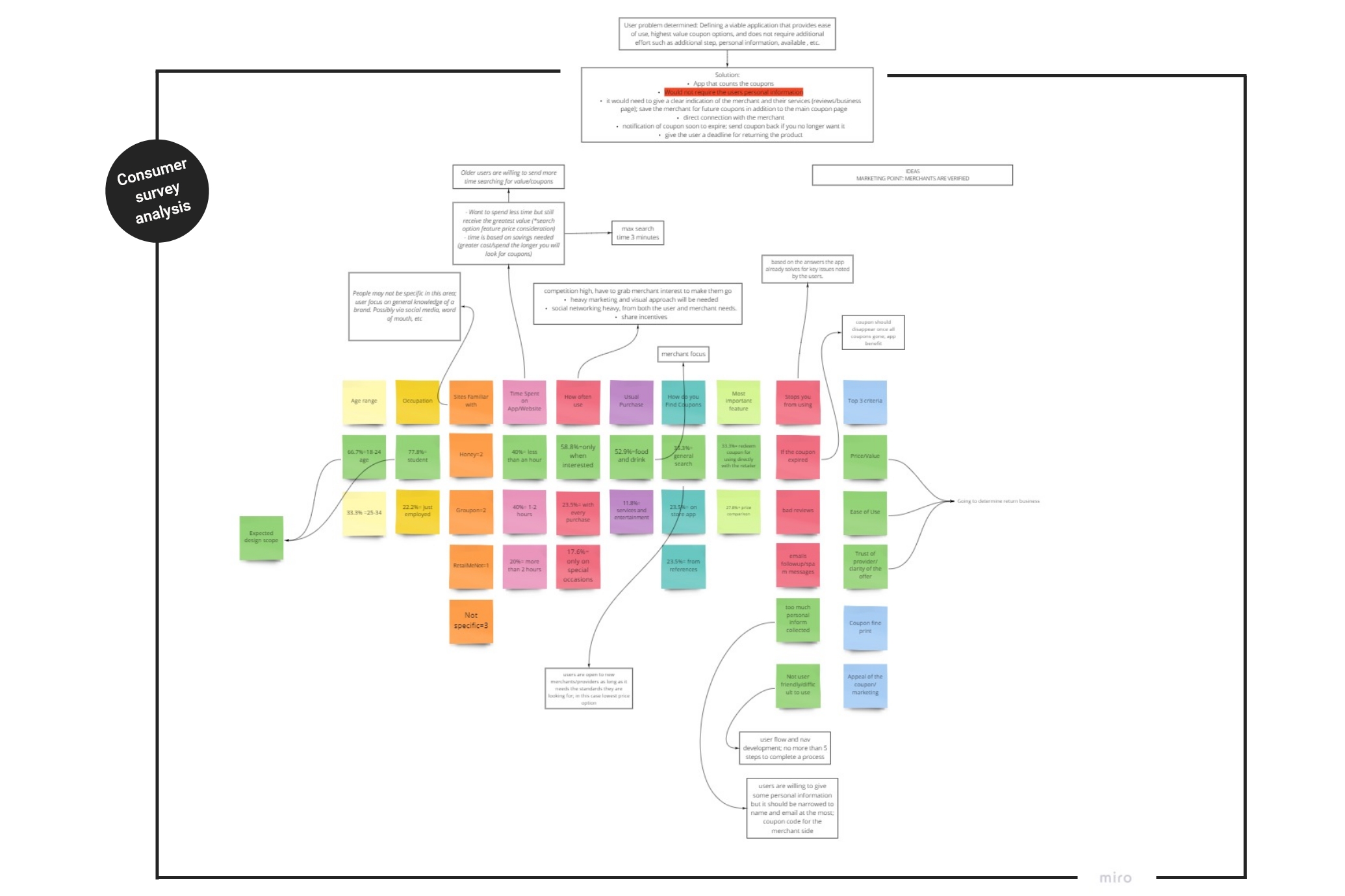
To better understand the design needs, we conducted surveys with both users and merchants, surpassing what our competitors offered. Here's what we discovered:
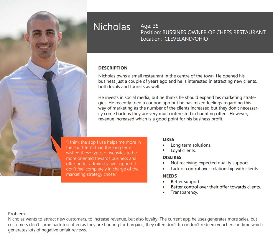
Key merchant needs:
- Spread vs Success. To track the spread of service in comparison to revenue.
- Engage a larger audience. A tool to engage a larger audience for more prospective clients.
- Singular marketing platform. A central marketing option that maximizes their local audience.
- Simplicity. An intuitive and efficient way to create offers and monitor them.
- User feedback. Quick access to user feedback to improve offers and learn their target.

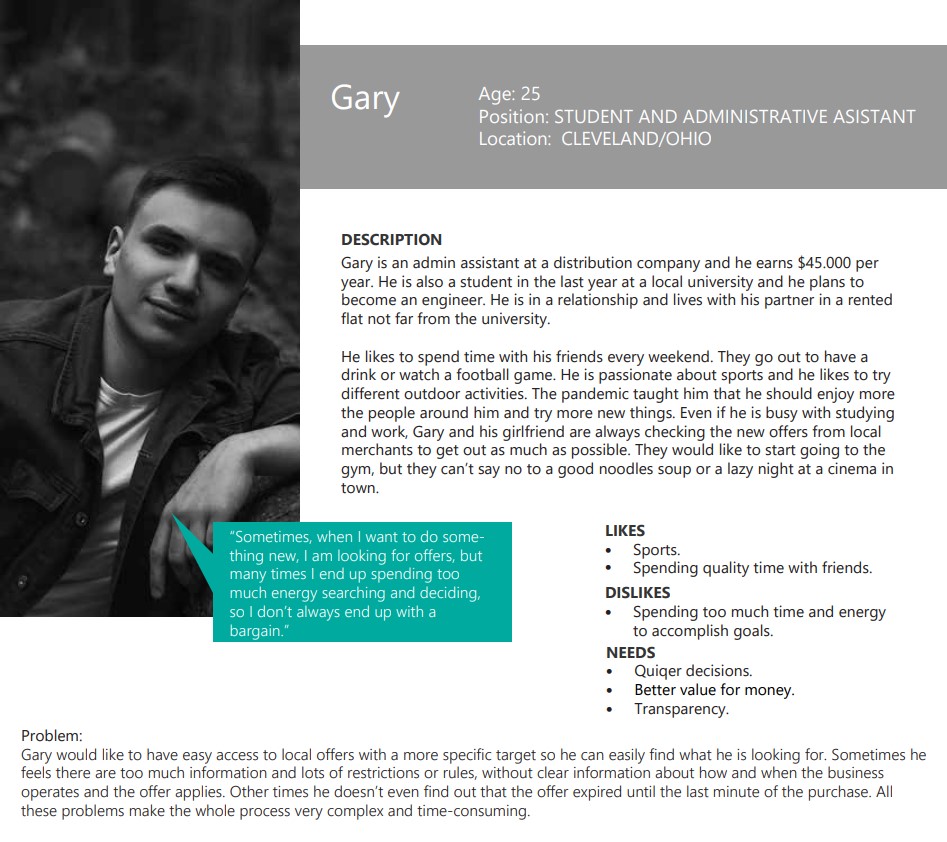
Key consumer needs:
- Less time to discover.
- More value.
- Merchant reliability.
- Low prices.
- Service reviews.
User personas
Based on the survey data, we identified two main user profiles to target with the app. By segmenting the audience in this way, we aimed to cover a wider range of users and better meet their needs.

We created a single profile to cover the merchants' side as the secondary beneficiary.
User flow and Red Routes
Before starting the design process, we needed to clarify the user flow and structure of the app. We used data from the competition and users to create a clear direction. As we discussed payment requirements with the client, we changed the onboarding pathway for users from optional to mandatory. To prioritize design tasks, we created a red route scheme, which helped us focus and clarify our goals.

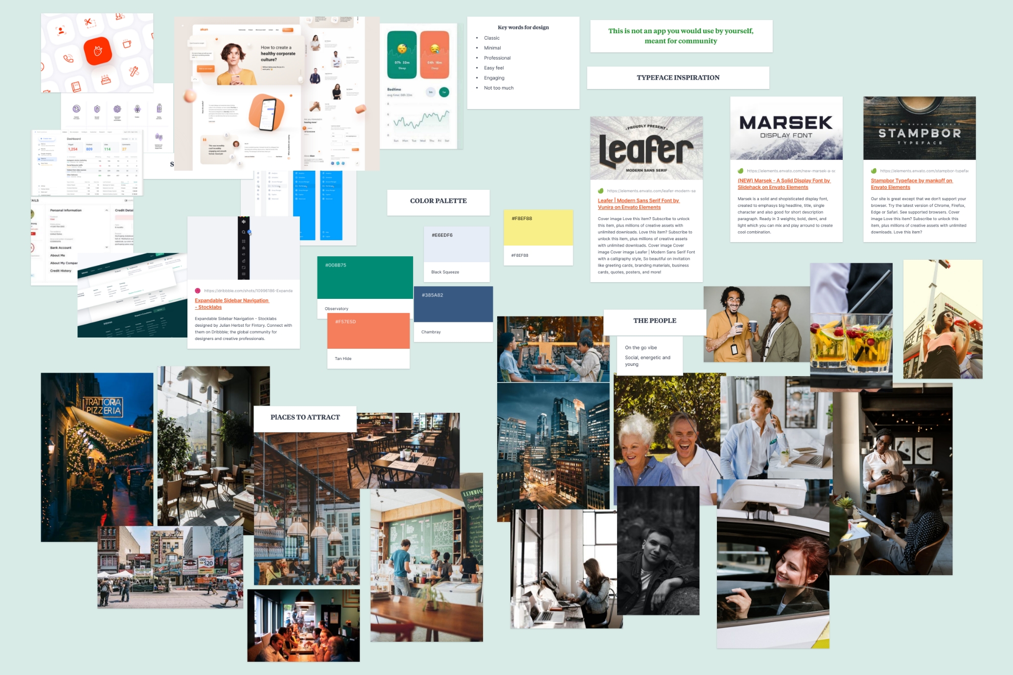
Mood board
Moving from research to the design phase, we began by crafting a mood board on Milanote. Our goal was to achieve a contemporary and invigorating aesthetic, so we opted for a green primary colour in our palette, also, representing money. We paired it with colours such as light blue and orange, which, when combined, conveyed a sense of dynamism and tranquillity.
Design
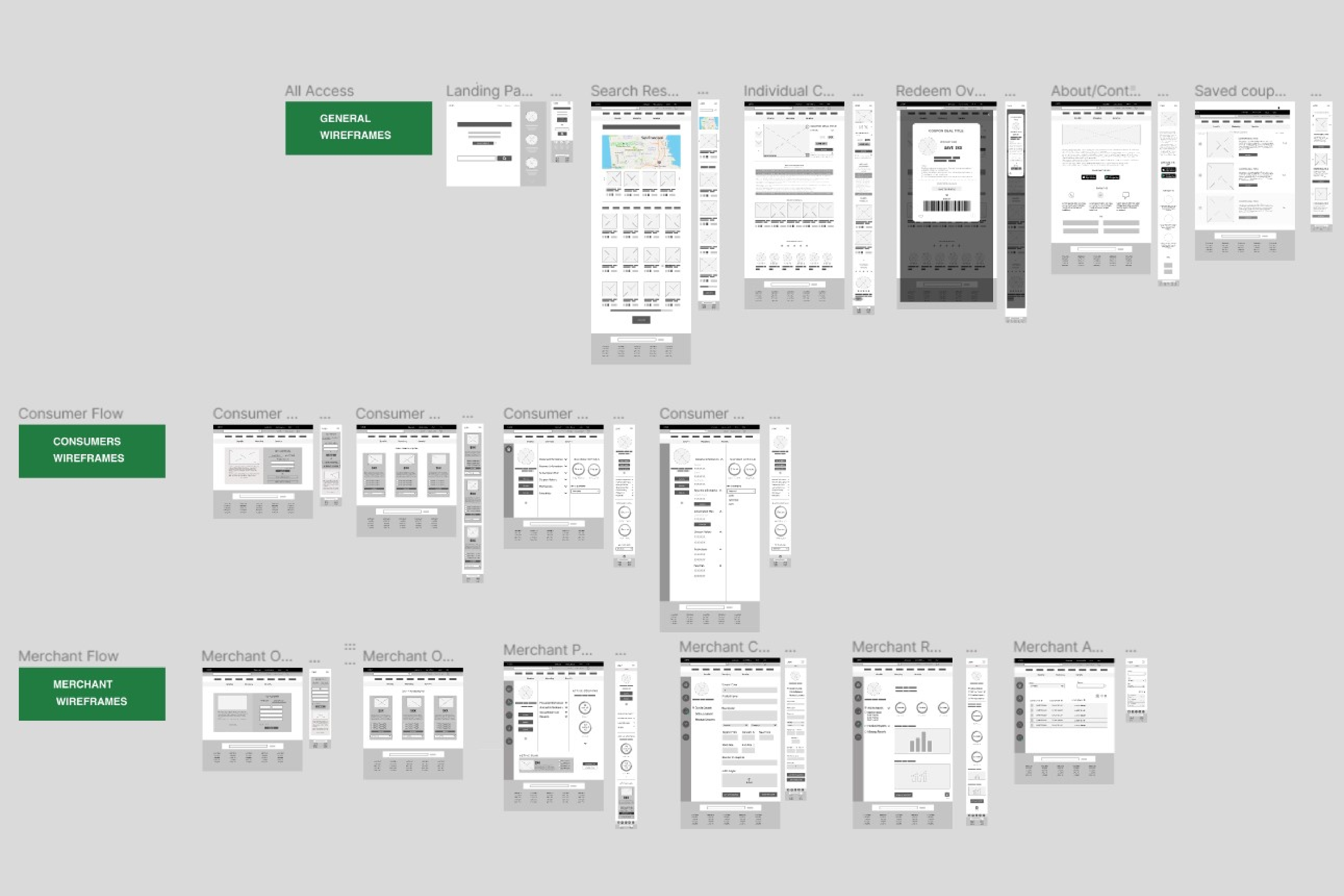
We utilized Figma as our primary design tool, progressing from sketches to black and white wireframes and ultimately arriving at the final defined design and prototype. During the initial stages, we regularly presented our designs to the client. As we progressed, we included the development team in our meetings to enable seamless communication about the feasibility of our design choices and potential challenges.
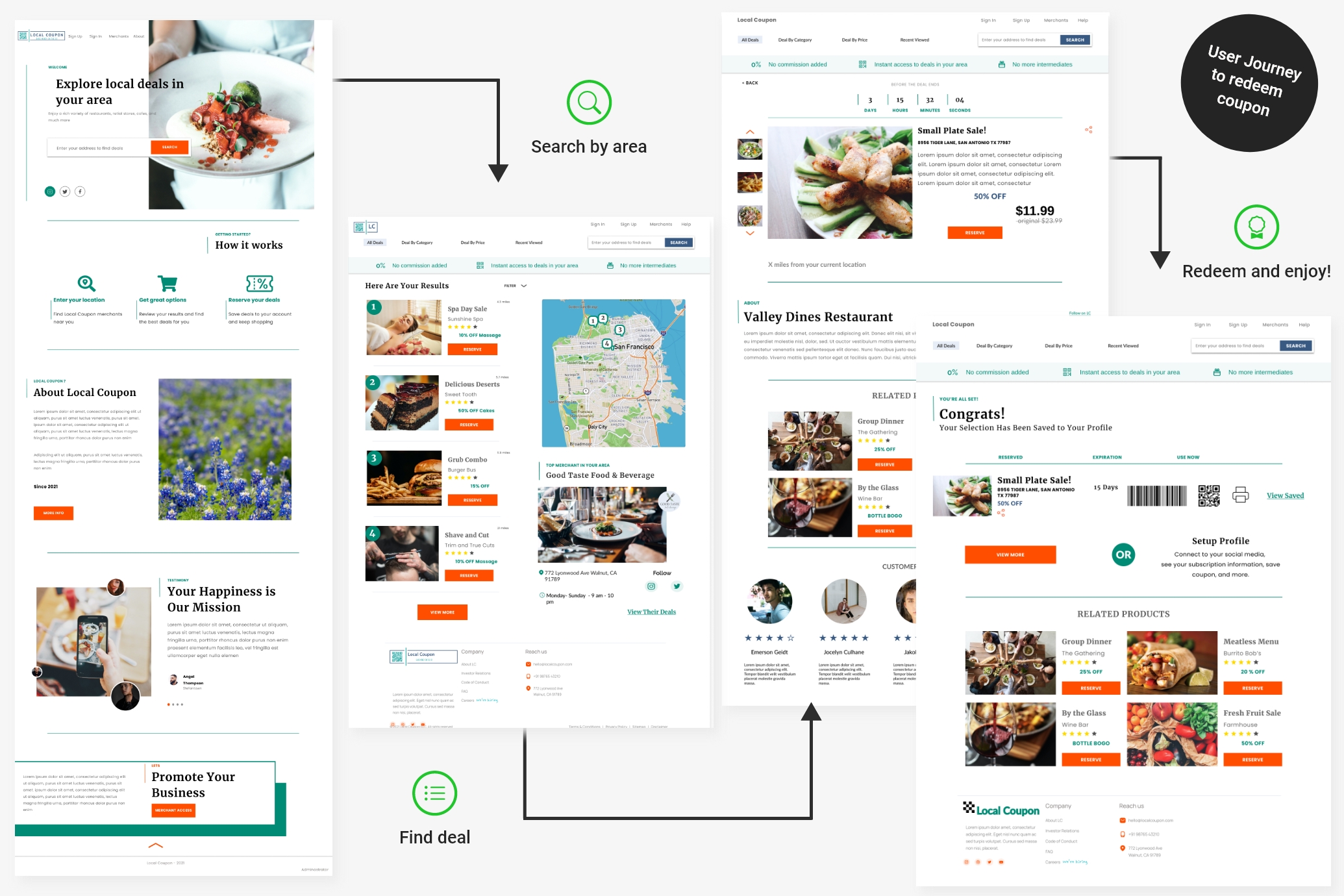
To keep the user journey simple yet informative, we designed a homepage that highlighted the search feature and provided essential information about the app. This included a 'How it works' section, details about the app's mission, and merchant promotion. Subsequent pages focused on results and redemption tasks, with a subscription banner placed under the menu bar to showcase the benefits of Local Coupons.
We also incorporated mapping, top merchant suggestions, filters, and review stars. Each deal was displayed with a discount percentage, and redemption could be done via a QR code or printed voucher, with additional product details, related deals, merchant info, and reviews available on the product page.
Users were informed of deal availability through a timer and could save or print their options. Lastly, we added a profile set-up reminder for a seamless experience.
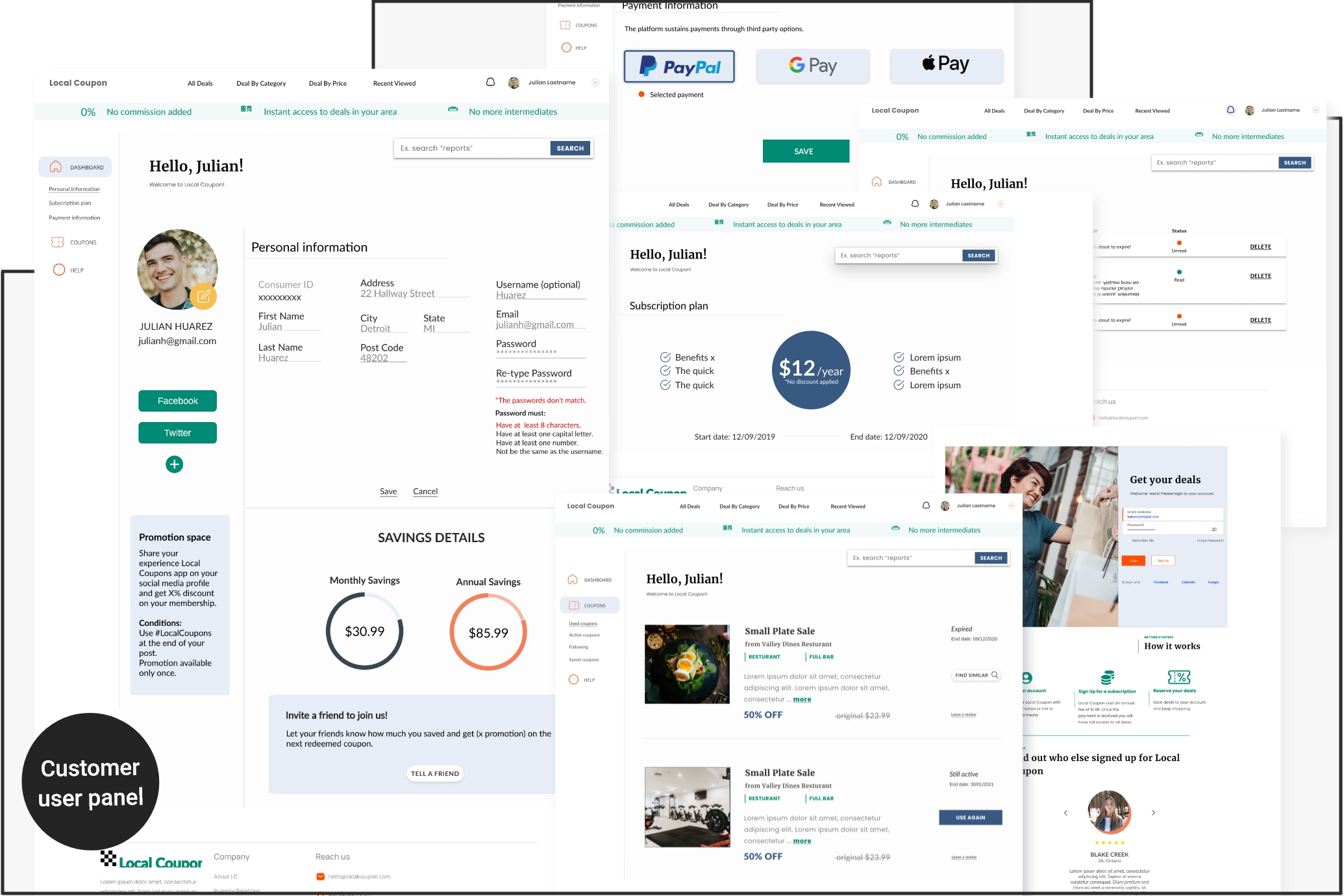
In the next project phase, we focused on the back-end design, dividing the admin, merchant, and customer profiles among the team. My responsibility was the customer back-end section.
Our lead designer developed key options for the admin section, such as:
- Monitoring users acounts and activity on the platform.
- Producing reports and statistics for marketing purpose.
- Help users and manage the platform.
- Review and activate deal packages.

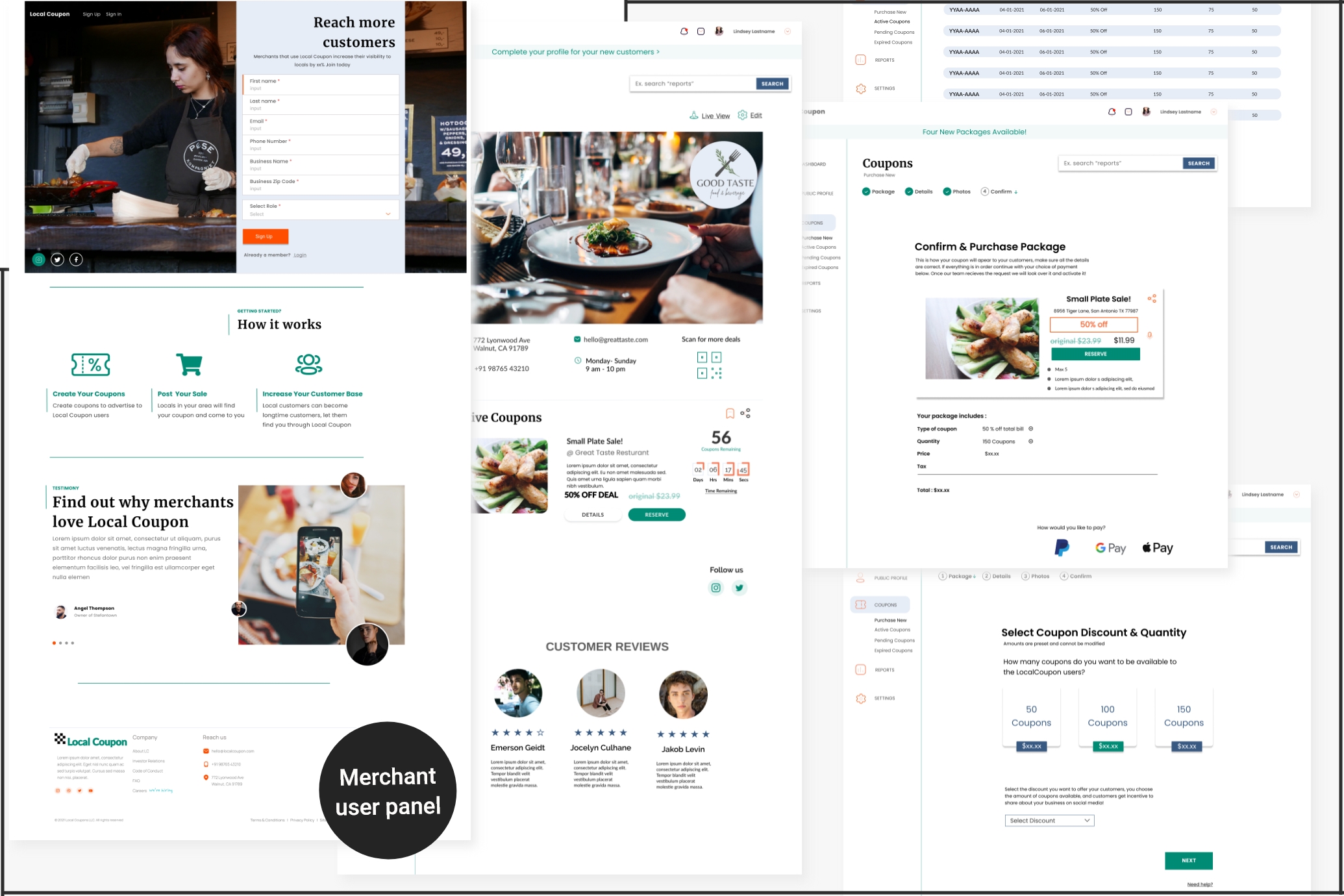
One of my colleagues was responsible for designing the panel for Merchants, which included the following key options:
- Separate sign in/sign up page.
- Public profile overview with edit option and preview.
- Management of pending, active and expired coupon deals.
- Purchase and personalization of deal packages for promotion.
- Merchandising reports and statistics.
To create the users' back-end panel which was assigned to me, I reviewed research data that highlighted customers' needs, including quick access to deals, spending control, highest value, minimal personal information input, merchant verification for security, and minimal steps and effort. As a result, I focused on the following options:
- A profile page with personal information, promo space and savings charts.
- A section to manage used and active coupons, follow preferred merchants for regular deals, and save coupons for future purchases.
- Subscription plan and payment management.
- A help page for customer service inquiries.
Usability Testing
To test Local Coupon, we interviewed ten participants who met the target audience requirements. All interviews were conducted remotely using Figma for real-time observation. Here's what we discovered.
What was successful?
After analysing the results of our usability testing, we identified what worked well in our feature implementation:
- The website structure and user flow were effective among tested users.
- Merchants appreciated the ability to reduce surplus deals by offering a set amount of coupons. Any unused coupons were returned to them for reactivation with an extended availability period. We also helped merchants establish estimated profits and potential user engagement by providing them with a set goal.
- Our dashboard provided real-time information on overall coupon sales, trends, and profits for Local Coupon. This allowed us to determine where the greatest profits were and make potential changes to both Local Coupon and the merchant's business.
- We offered users exclusive access to coupons from local merchants not available to the general public, incorporated automation features like one-click redeem and access, and localized offer options to the nearest proximity, encouraging them to become paying customers.
What needed improvement?
Changes required for design or future implementation included:
- Adding social media Sign Up option.
- Enabling direct coupon reservation from search results page.
- Improving tab design for clearer navigation.
- Better highlighting of links.
- Allowing users to reserve multiple coupons at once in saved coupons section.
- Adding review section for merchants from customer tabs.
- Providing visual cues for unavailable coupons.
Learnings
The Local Coupon project focused on creating a user-friendly app for accessing deals and discounts from local merchants. We were involved in team work and applying research methods, user testing, and iterative design improvements to create a platform that met the needs of both users and merchants. We identified the importance of clear and simple user flows, as well as the ability to customize and personalize deals for each user. We also learned the importance of user-centered design and iterative improvements to create a successful app or platform.