

PCXNow
An e-learning platform that inspires young people from every background to discover and explore the gaming and design industry.
General
Problem-solving for: redesign and development of an e-learning platform
Target audience: students age 12-18 interested in gaming, coding, and design
Designed for: Desktop only
Client: PCXNow
Duration: 2 months
Role: UI Design
Overview
PCXNow is a forward-thinking organization that empowers and prepares young individuals for careers and opportunities in the gaming and design industry. Their innovative programs are designed to enhance students' coding and design skills, with a primary focus on exploring and understanding the eSports community.
Our team worked on the development of the Lvl Up Academy, a self-paced program aimed at providing students with a designated path to develop their skills, work alongside mentors, and build a strong portfolio. To ensure efficient and effective development, we broke the project down into phases, with the information below outlining our approach and progress during phase 1 of the design process.
Current Challenges
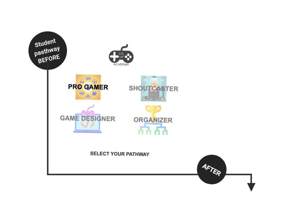
Visual Design: PCXNow failed to establish a brand identity or a central theme for their Lvl Up Academy program. The design and layouts they implemented were basic and did not address all of the intended features. They needed to address their organization's identity as well as their marketable identity for their targeted user base.
Navigation Structure: The navigation structure was cumbersome, with different layouts of information displayed depending on how the user entered the platform. We believed that Lvl Up Academy required a single access point and a more structured information architecture. We also agreed that the platform needed to expand beyond the basic user interface and provide more in-depth stages of user interaction.
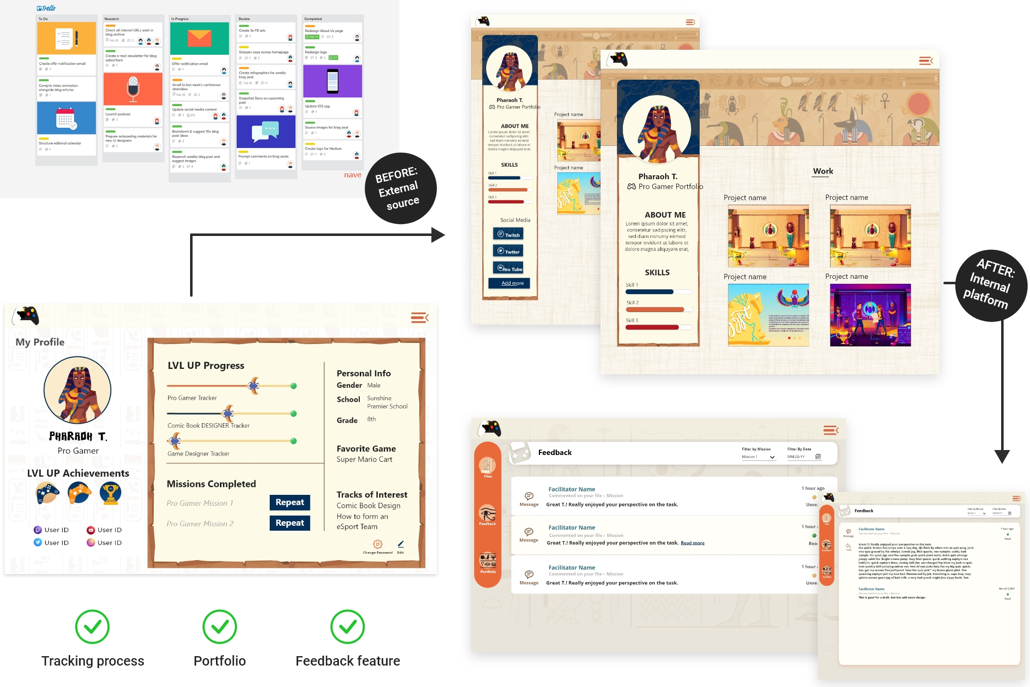
Task Automation: PCXNow relied on third-party sites for user submissions and progress tracking, which was not ideal. All processes needed to be managed in-house on a single platform.
Backend Process: Although PCXNow recognized the interactions necessary for the program's functionality, they failed to establish a process to execute these features.
Accessibility: PCXNow did not integrate measures to ensure that the product could be accessed by all, resulting in a platform that was not fully inclusive and lacked the necessary features to cater to the full scope of the target audience.
Implementation of best practices
Challenge 1 - Visual design:
To effectively appeal to elementary through high school students, the overall visual concept of the design needed to be more youthful, incorporating visual patterns, characters, and colors that captured their attention. The mood of the design should have centered around animations and video gaming to make it more engaging for this target audience.
Solutions
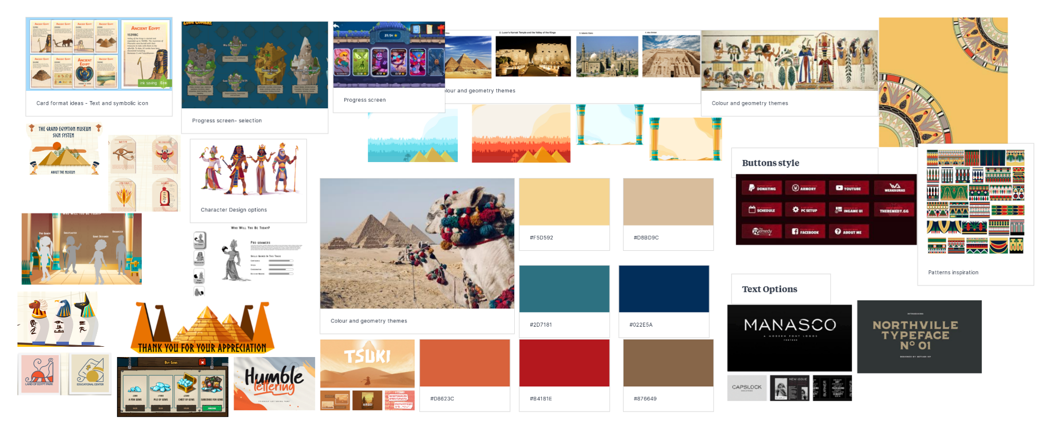
The client established a core theme: The client established a core theme for the program, which was to maintain consistency with future PCXNow programs based on an Egyptian theme. Given that the company's full name was Pharaoh's Conclave, we decided to incorporate references to "pharaohs" or Egyptian symbols throughout the design. Despite my limited experience in the gaming industry, we managed to incorporate thematic key indicators of this design into standard elements such as patterns in the buttons, symbolic watermarks as backgrounds, navigation icons, and more. This portion of the design relied heavily on UI enhancements to ensure that the theme was consistent.
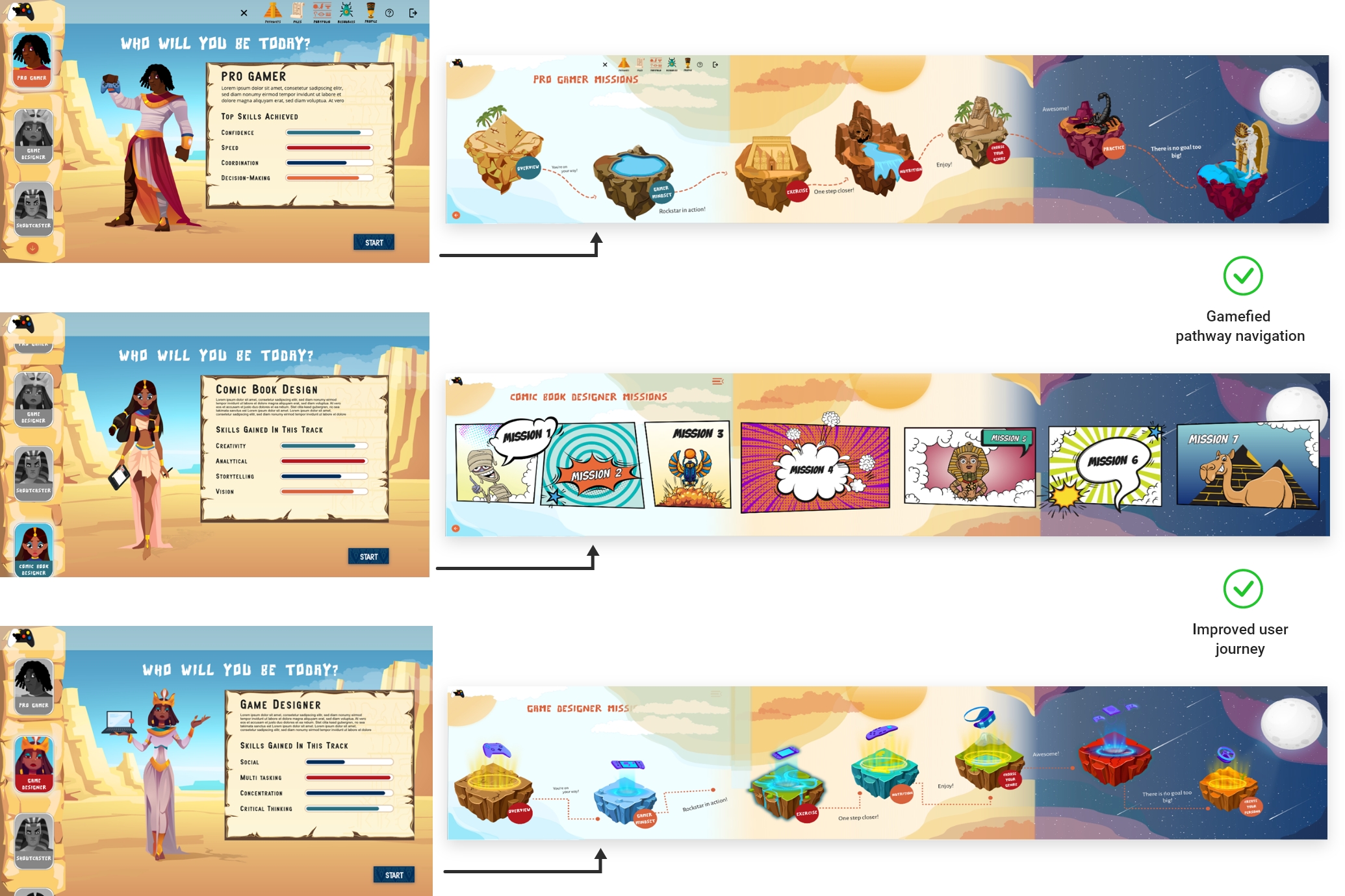
Redefined user layout: To address the previous platform's lack of context for style elements and inconsistency, we redefined the user layout. The design took on a standard text/image layout, and we developed detailed character navigation layouts. We transferred the key points of the user journey into a game progression flow, which received positive feedback from both the client and teams involved.
Created modules designs:
We also created module designs, as previously there was no module design to access the user's pathways. We designed three pathway landing pages customized according to each pathway's theme, such as game designer, comic books, and pro gamer, keeping in mind the target audience and the idea of a gamified experience.

Challenge 2 - Navigation Structure:
To improve the navigation structure, we implemented a key solution of incorporating access via a separate platform. Since the organization was still enhancing its main site, we created a temporary solution that allowed users to select any of the existing login options but be directed to the new platform.
Within this platform, we developed a single state of login and three key solutions for navigation: accessing coursework, accessing user portfolios, and accessing files/profiles. This allowed for more efficient and organized access to the necessary information and coursework for users.
Solutions
Improved & Established User Journey: The user journey was a crucial component that needed improvement and establishment. We needed to ensure that users could easily access all aspects of their personal information, as well as their coursework. After analysing the initial platform and researching competitors, we realized that the client had not considered important features such as student progress tracking, communication functions between students and facilitators, or editing tools for accessing resources. To address this, we conducted a brainstorming session to determine necessary access points through a journey map, defining the missing elements and scenarios.
To help users navigate their pathway for a particular subject, we created characters that reflected the topic. This allowed users to confirm they were on the right path and provided a gamified experience.
Created module structure: Creating a clear and simple user journey while still offering a gamified experience was challenging. Therefore, we utilized a gamer approach and developed an interactive map. Users could select their course on the map, choose sub-courses if applicable, and then begin their assignment. The map was the key access point for users to complete their journey.
Redefined user layout: We also redefined the user layout to establish a sense of navigation and structural consistency across all pages. We implemented a side panel for users to navigate the pages, with the option to use the hamburger menu at the top of the page if the side panel was not accessible, specifically on the course/missions page.


Challenge 3 - Task Automation:
During this stage, we had to communicate extensively with stakeholders to clarify the specific features they wanted to include in the user's profile. This led to multiple design reviews and meetings to ensure we were on the same page.
Initially, users were required to upload their work on a third-party site that handled tracking and communication. However, this meant that users had to track their progress and task completion through two separate sites, leading to confusion and inconvenience. To simplify the process, we eliminated the need for a third-party submission site and allowed users to upload their work directly onto the platform.
Solutions
Assignment sharing: We had incorporated and developed a section for users to upload their files, which could be reviewed, receive comments, and required facilitator approval for users to proceed with their coursework. Furthermore, the files could be added to the user's portfolio page.
Developed feedback feature: To provide users with feedback on design tasks, we developed a new feature that allowed facilitators, co-facilitators, and pathway experts to leave comments directly on the assignments. This allowed students to make modifications as they worked through the task. All feedback was visible to everyone associated with that particular assignment, such as all experts and co-facilitators assigned to review the user’s work. This feature was designed to reduce repetition and provide more efficient feedback to the user.
Process tracking: A tracking process was designed and implemented on both the individual assignment pages and the user profile section. This provided users with greater visibility into their progress through missions and the overall pathway.
Function to showcase and share work through a portfolio page: We expected users to have a public-facing portfolio and designed it while considering both the user's age and the work they were expected to complete. To add their work, we created a simple process that allowed users to upload a final approved project and provide information about their background. We also incorporated restrictions for users under the age of 16, which included pre-approved profile images and no option to share their social media links on their portfolio.
Challenge 4 - Backend Process:
For the project, I had the task of developing a backend system that would serve three different groups of users - students, admins, and facilitators. The system needed to have adequate functionality to meet the various needs of each group. This included facilitating the review process for facilitators, who needed to be able to provide feedback and comments to the target users or administrators.
As there was no pre-existing process or data to work with, I conducted research on e-learning procedures and incorporated the factors that were most applicable to the facilitator process. This was the first time I had worked on a project of this nature, and it required a significant amount of planning and development to ensure that the system would meet the needs of all users.
Solutions
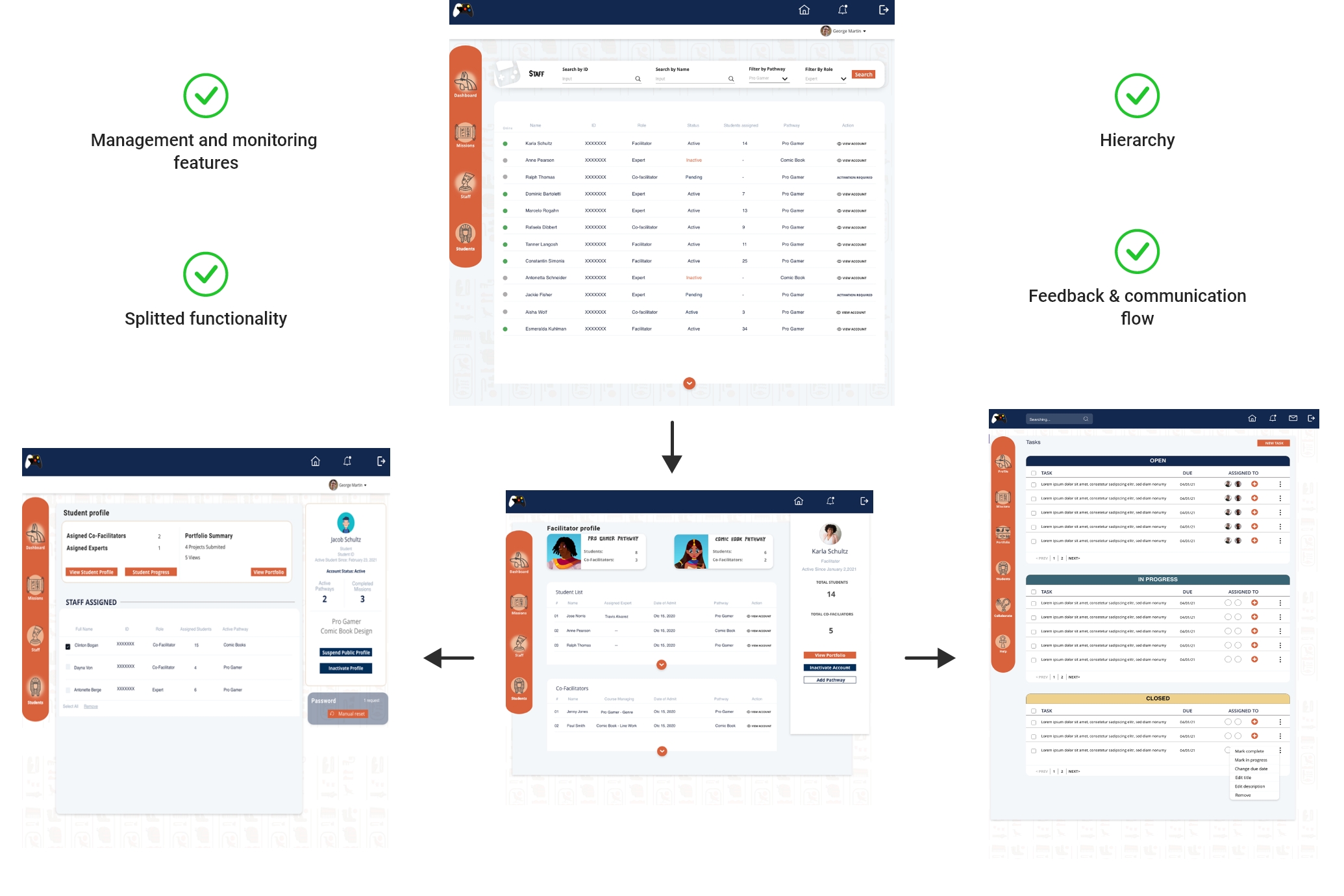
Defined roles and responsibilities to develop user flow: We created a mind map of the processes required by administrators, facilitators, co-facilitators, and experts to cover the multiple cross-functional features. To make the design efficient, we incorporated shared design screens for features that could be used for multiple areas. For example, both facilitators and co-facilitators needed full access to user progress and assignments, so they were given the same page designs. Experts, on the other hand, only needed limited access to user progress, and their design reflected that.
Access hierarchy: The entire process required monitoring by an administrator, so we created an admin panel and integrated the necessary management features. At that stage, the most critical components were monitoring existing and new users, activating or deactivating accounts as needed, and assigning new pathways to facilitators. We postponed a more in-depth development of the admin panel to address it in phase two of the project.
Established communication and information flow: To ensure that there was a flow of feedback and agreement among collaborators on the success of submitted assignments, we developed a feedback page that displayed comments, scoring, and sign-offs from collaborators. If any area of the assignment was unsuccessful, collaborators could send the information back to the user for review, and the other collaborators would be notified when changes were received. Facilitators had the main control for assigning users to collaborators to assess their work. Therefore, we created functionality that enabled the appointment of each reviewer and the sending of invitations to recruit new collaborators.

Challenge 5 - Accessibility:
We prioritized addressing accessibility for the client early on in the development process to avoid future issues. However, due to platform limitations, we focused on implementing key accessibility factors first. Additional features, including language translation and input assistance, were noted for further development in phase two.
Solutions
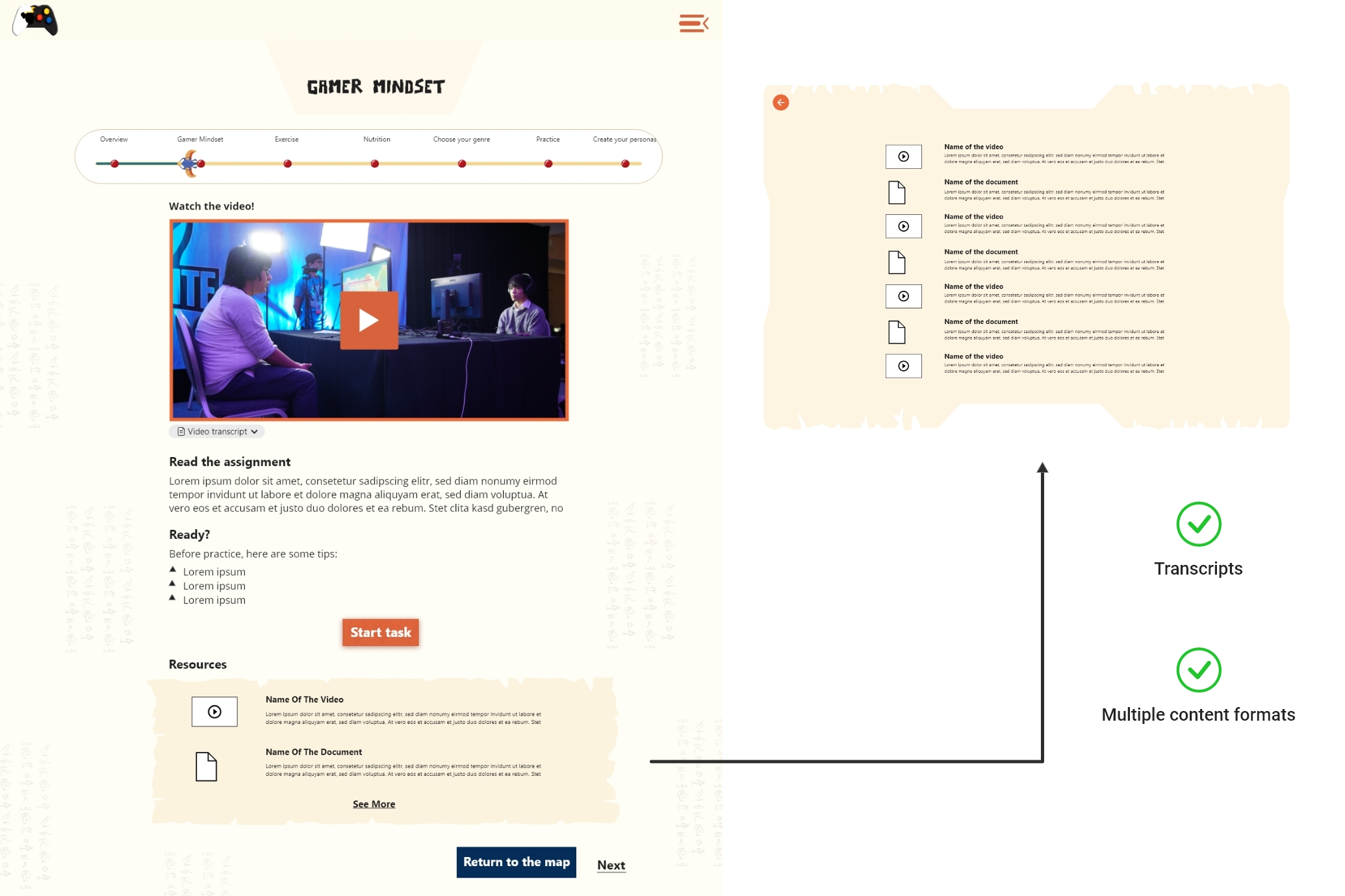
Descriptive transcripts: Descriptive transcripts were included for all media files integrated on the assignment pages, in accordance with the WCA guidelines. To access the transcripts for each video lesson, users could simply click on a drop-down option located on the same page as the video, and view them in text format.
Skip navigation feature: When we were developing the user tutorial feature, we aimed to provide existing users with easy access to tutorial information for each course, while also allowing them to skip the information if not needed. Our goal was to offer a helpful reference point for users as they worked on their assignments.
Architecture information: With the user in mind, we developed forms and content structure by following the best practices of accessibility guidelines. We made sure that standard elements, such as colour palettes, text and background contrast ratios, error notifications, and onboarding criteria, were complied with.
Takeaway
A major key aspect that was emphasized in this project was consistency. Ensuring consistency throughout the entire task flow made it easier for users to navigate and recognize patterns within the platform. Consistency was not only present in the visual elements but also in adapting these elements to a series of commands that created a gamified navigation experience according to the platform's purpose and user expectations.
One of the challenges we faced in this project was creating a back-end panel to organize everything within a hierarchy for multiple entities: students, facilitators, co-facilitators, and experts. This helped us learn how to organize information and establish best practices to obtain a clear user pathway with defined tasks and features for each role.
However, we learned that not all ideas make it into the development stage, and many adjustments are made during the process with stakeholders. Regularly scheduled meetings for every stage of the process helped us understand how to discuss different points of view and gave us a good comprehension of the process itself and how to present ideas.
Plan of iterations for the following design phases:
Responsive design for multiple devices.
In-depth view of accessibility according to the beta user feedback.
Platform update if necessary according to the testing results of beta variant.
Adding more gamified elements which we proposed at this stage of design like rewards systems to encourage continuous play.